Creating a Design System for India's largest grocery delivery app.
I co-led the zero-to-one development of a unified design system for BigBasket’s customer app, Melon, that reduced design debt and created a foundation for scalable product development. It improved team velocity and consistency, earning adoption from 200+ product and engineering collaborators.
My Contribution
Landscape Analysis, UI Auditing, Visual Design, Documentation & Guidelines, Workshop Facilitation, DesignOps
Team
5 Designers - Harshita Passi, Sudarshan Srinivas, Jahnavi Vegad, Raghav Vasudevan, Me
Company
BigBasket
Problem
The team needed a robust design system and organized structure.
BigBasket was rapidly shipping new features, but without a consistent design language. Repeated UI work, inconsistent patterns, and slow collaboration increased delivery time and hurt usability across the customer app.

No design system = disconnected user experience
Audit
The team needed a robust design system and organized structure.
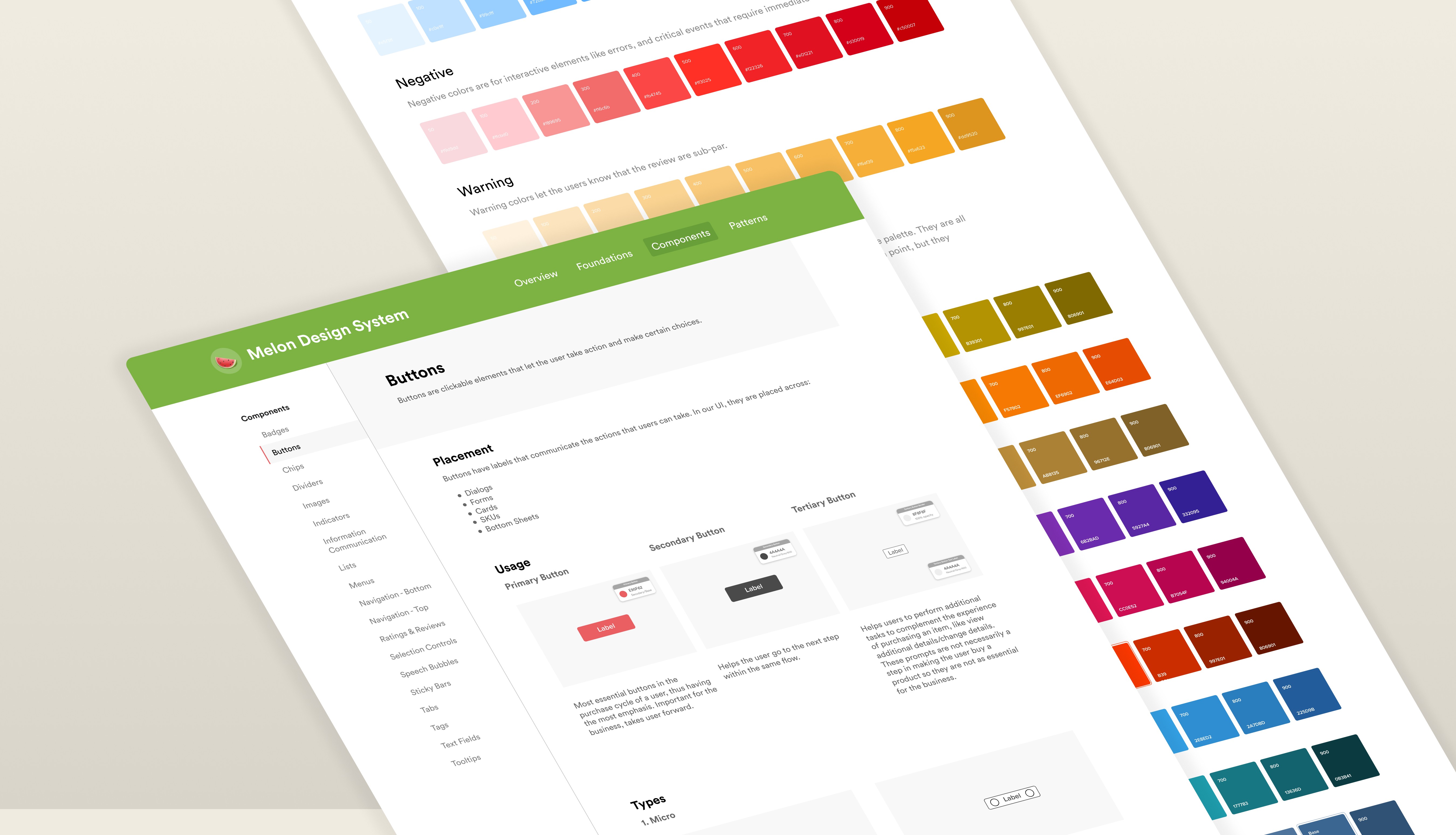
We ran a full visual audit of the BigBasket app, documenting every component and foundation—colors, typography, spacing, and iconography. This helped us map what existed, identify inconsistencies, and uncover gaps that needed standardization.

Componentization
Building blocks before screens.
After auditing every screen across the product, we started grouping what we found into a structure that could actually scale. We organized everything into three layers that became the backbone of the system:
Foundations – the visual language (typography, color, spacing, iconography) that gives the product its identity
Components – reusable UI building blocks like buttons, inputs, and tooltips
Patterns – repeatable interaction structures like bottom sheets, empty states, and dialogs
We knew that if we didn’t define these layers clearly, the system would fall apart later. So before jumping into components, I focused on getting the foundations right—starting with typography, iconography, and spacing.

After establishising the visual language, creating new components suddenly became was simple because of the basic rules that we previously laid out. Every component that was added came with its own guidelines, specs and behavior based on any previous components it was made up from. Taking button as an example, we utilized our typography styles for the text, our color palette to determine the colors for every state, and spacing presets to ensure scalability to different sizes.

Button variations and interaction states
Had different variants for each component
While most components were unified, we decided to keep the native properties to maintain the familiarity associated with each platform. An example of this is our custom top navigation that adheres to native guidelines for iOS and Android but utilizes Melon's typography and iconography.

iOS and Android top navigation
Shared component library used for creating high fidelity designs
I got inspired by a design video and Brad Frost’s Atomic Design framework, and used a watermelon analogy—breaking it into skin, flesh, and seeds—to explain how a system can scale from simple building blocks. Since watermelon is one of BigBasket’s top-selling items and matched the brand colors, I pitched Melon as the name of our design system through a fun slide deck that explained the philosophy.
I ended up presenting this deck 20+ times across the organization.
Documentation
Standards only work when they’re written.
We knew that good documentation and clear guidelines were key to making our design system successful and sustainable. This part of the process called for a lot of empathy—after all, the goal was to make things easier for everyone using the system
Template for documentation structure & guidelines
To help, we created and regularly updated documentation right inside the Figma file. This included everything from design principles to quick-start guides and best practices for designing and testing components. While the details varied slightly for each component and pattern, the documentation was always clear, detailed, and easy to follow.
A clickable prototype of the documentation
Impact
Adopted org-wide by 200+ engineers and product teams.
I built and launched the company’s first design system, improving design–dev collaboration, speeding up delivery, and creating a unified product experience across teams. Here are some key highlights:
Audited 250+ UI components across the product ecosystem.
Designed and shipped v1 of the reusable component library + guidelines.
Improved design-to-dev handoff efficiency by ~35%.
Increased UI consistency and reduced design debt.
Led onboarding and training sessions for 15+ designers and engineers.
Adopted by 200+ product and engineering team members.
Takeaways
The real work happens outside Figma.
This was my first official product design internship, working with a professional design team, and it challenged me to grow in ways no classroom or tutorial ever could. I learned that real product design isn’t just about creating interfaces—it’s about clarity, trust, and teamwork.
Design systems go beyond components — Learned how to build and scale a design system, create flexible components, distribute a shared library, and drive adoption across teams.
Documentation is leverage — Discovered the importance of leaving clear notes and decisions behind to prevent confusion, unblock teams, and scale knowledge.
Influence matters more than ideas — Learned how to earn buy-in, defend design decisions, and communicate value to stakeholders to move work forward.
More work, more stories.


